Now, a great number of you will
be feeling faint at the thought of me posting something sensible for a change,
but I had a couple of conversations over the last few weeks talking about painting
flesh. They were prompted by those Woodland Indians I mentioned a short(ish) while ago. While I'm not a master painter, I've found my comfortable method of painting faces and flesh area which I can use to bash out units or take my time and add more character.
I did a post here about washing with
oils here, back in March 2012 and, although the principle hasn’t changed much, the materials have. Given that
oils washes can take a while to dry and since the advent of decent acrylic
inks, I’ve generally, though not always substituted oil for water.
Not being gifted with the best
eyesight in the world and also being lazy (probably more this than anything),
I’m a great believer in letting the sculptor do the work for you. After all, he/she
has a great talent and really does do the lion’s share of the work; we merely
do the colouring in. That said, some sculptors aren’t the best and others can
be variable, so you do have to apply a bit of effort to make a passable job now
and again.
There are many really good
painters out there and, first of all, I suggest you scout round and see what
they do. It’s all a question of style and you’ll develop your own fairly
quickly (if you haven’t already done so). I think the key is to pick what you
like best and try to work with the techniques until you find the one you’re
happiest with. This will change from time to time and that’s normal, but, if
you don’t paint too often, I wouldn’t keep chopping and changing each session.
Every technique develops with practice and you will have to put some effort in
to developing your own. Don’t expect miracles overnight. (In my case, it’s been
a damned long night . . . .)
Right, you’ve not going to become
a budding Michael Angelo from reading this, but you should be able to produce
passable flesh tones reasonably quickly. There’s nothing earth shattering about
anything here, but nobody told me about this sort of thing when I was starting
out and I had to pick and choose and practise as new materials became
available. Hopefully you won’t have to if you like what you see.
I’m not going to give a blow by
blow description of what the ‘right’ look is for flesh and particularly hands
and faces. Similarly, I’m not going into great detail in a blog. It’s not the
right vehicle for this (and I’m not an artist), but there are a few points to
bear in mind:
Colour intensifies on a small
surface and colour (and detail) fades with distance. However, wargamers like
distinctive looking units on the tabletop. Once you sort out this conundrum
you’ll be well on the way to a Nobel prize.
The thicker the paint, the more
detail it will cover up. The thinner the paint, the harder it is to achieve a
solid colour and the easier it will rub off.
You’ll most often be painting
figures of troops who spent the majority of their time outdoors and frequently
unwashed so they’re going to look more like Farmer Giles than a catwalk model.


You can’t see people’s eyes in
any detail much beyond twelve to fifteen feet, but you can still see their
expressions.
‘Seven o’clock shadow’ isn’t that
obvious at a distance (see the note on eyes above), so don’t overdo it.
Above all, remember that, even holding
a figure up close, we’re looking at a person who would be, say, across the
street were if you were stood at your front door. Next time you’re in the
naughty seat when your partner is in a shop, kill the time by looking at people
and try to remember what you can actually see. Don’t stare though because people
can get awfully touchy about that . . . .

So, I guess the upshot of all
this is to develop a general colourway for the bulk of your armies and then
work out variations. There’s a great deal of information on the web about skin
tones, so just give Google a whirl. Look at this group from some sci-fi film or other - each one different:

The principle of painting the
flesh is quite simple and consists of painting the areas, washing with acrylic
ink and then highlighting. You can get as sophisticated as you want and later
add rosy cheeks (too much port?) or whatever, but I’m really talking about a
general finish for the bulk of your troops. Once you’ve picked or developed
your palette, it’s a relatively simple case of painting and washing. You can
paint on the base shade and first highlight and then apply a wash or simply
paint on the mid tone and then the wash. Once the wash is dry, then you reapply
the mid tone which gives a good highlight and, as the sculptor had already done
the work for you, it brings out the character of the face.
Sometimes it isn’t necessary to
reapply the mid tome to the highlights and other times you need to do this and
actually apply a final highlight shade; it usually depends on the sculpt, but
it can also depend on taste and what kind of character you want to portray. However, occasionally it’s necessary to
paint the whole face with three shades and then apply the wash to get a decent
effect, particularly if the sculptor has only managed a ‘Cyberman’ look. The
benefit of taking this approach is that the ink wash tones down the variation
in highlighting shades and pulls it all together.
The colours I normally use are
pretty standard. Reaper Miniatures do several triads of flesh tones, but,
although I have a couple, they have their Vallejo or craft paint equivalents.
The trick, if there is a trick, is to look at the colour, not the name on the
bottle. So, for general purpose European flesh, my base colour is anything akin
to Vallejo Cork Brown, the mid tone their Game Colour Bronze Flestone and
just about any beige shade graduating up
to, say Game Colour Bone White for highlights before or after the ink wash. Not
at all scientific and generally not related to any ‘flesh’ colours.
For all that, the key is in the ink,
which gives the overall tone to the finish. I use three types, more because
they’re what I’ve accumulated than from any artistic quality.
Windsor & Newton: Peat
Brown, Nut brown and Sepia
Games Workshop: have
changed the names over the years, but they produce three ‘browns’ of which the
two best were once known as ‘Gryphin Sepia’ (which I think is now ‘Seraphym
Sepia’ ) and ‘Ogryn flesh’ (which might now be ‘Reikland Fleshshade’)
Army Painter: Warpaints
Soft Tone and StrongTone inks
These can be thinned with water
to vary the depth of colour and I usually add a dab of Windsor & Newton
Acrylic Flow Improver which breaks surface tension and aids the flow of the ink
into recesses. This is really only a commercial version of thinned washing up
liquid, but it’s relatively cheap, lasts years and saves messing around.
The benefit of using the inks is
that, even using the same paint triad on all the figures, different ink shades
can produce variations in flesh tone. While I tend to use the Army Painter Soft
Tone ink more than the rest, I often use the others just to give variation.
That’s it more or less. Judicious
use of Google will give you plenty of illustrations of bone and muscle
structure for faces, hand and other parts of the body so you shouldn’t have to
guess where to put the highlights, although with some figures your guess is as
good as mine!
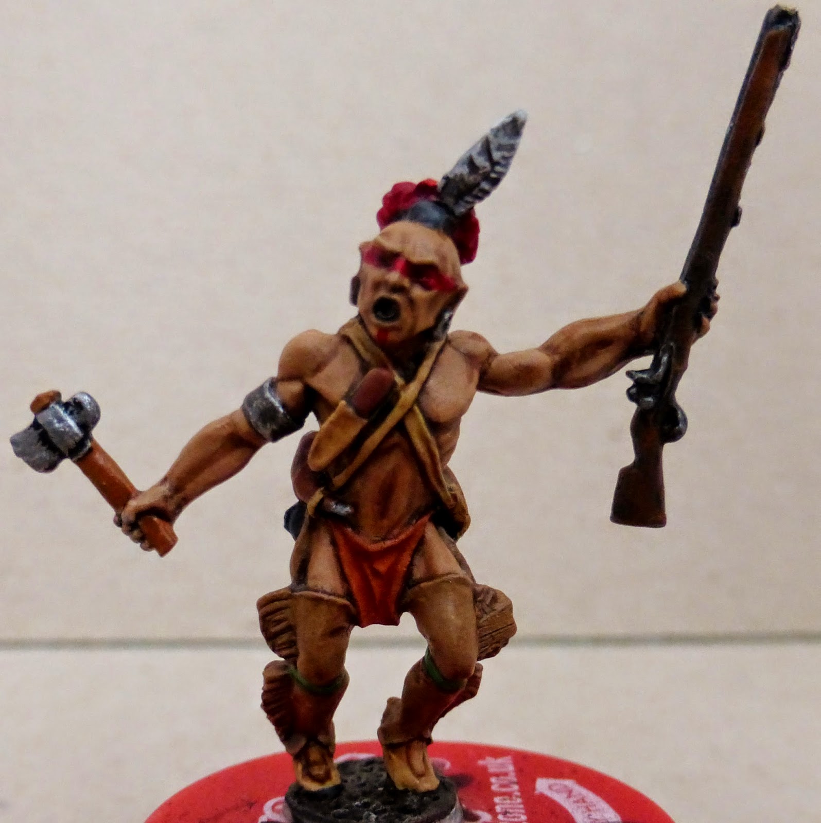
I’ve put some photos of figures
below to give you some idea of what I’m talking about, but the only real way to
get the hang of it is to give it a try.
.jpg)
.jpg)
.jpg)
.jpg)
.jpg)
.jpg)
%2B(3).jpg)
.jpg)
.jpg)
Oh what the hell, let's have another picture of Princess Leia . . .

Sound advice Sir, but come on? only two pics of Princess Leia??
ReplyDeleteWell the first one was to show thte differing flesh tones and the second ws to show the effects of light and shade. Honest . . . .
DeleteAn interesting read Gary!
ReplyDeleteI particularly like your Native American skin tone and I like the variations you get by using different washes and inks on the other figures. With Vallejo I always use a flow improver as their paint tends to be thicker than Reaper.
ReplyDeleteI've recently reworked my approach to skin tones. I begin with the mid tone and then shade down with two or three levels of darker shades into the shadows. Then I slower layer up to my high points. I'm finding my transitions are smoother this way and that I get better gradients. It generally takes me two hours just to do a face though and that's not practical for someone painting troops. I need to learn more so that I can start mixing my own custom flesh tones though.
Oils seem to be the answer if you're after very snoothe shading without the really high skill level (I am!). You can use oils for the basic stuff and then finish off the highlighting with acrylics, but it depends on the quaity of the sculpt.
DeleteMy painting 'hero' was a chap called Joe Shaw from Oldham who was a trained artist. He had an amazing eye for colour and detail and it was Joe who told me to look at actual people rather than photographs to see the colour tone variations. He once painted a 90mm Zulu figure (in oils) which looked like a real man frozen in time. It was an incredible piece of painting and he'd used a basecoat of emerald green!
Thank God I only paint wargame figures.
An excellent read Sir! Very helpful and interesting even though I have been painting these things for more than 40 years!
ReplyDeleteA good guide there Gary..
ReplyDelete